Design Concept: One Nursery, Two Ways
Twinkle Twinkle, Little Star
Designing a nursery is always such a special honor. It’s hard to think of a space that’s more important than where a brand new tiny human gets to know their family and starts discovering their world.
For many expecting families today, the biological sex of their child is often a total surprise right until the moment they arrive. As a result of this trend, we are often presented with a design brief asking us to pull together a more gender-neutral space that would work well for any new bundle of joy.
One particular client went that exact route with their first child’s nursery, which was a more contemporary palette of mostly black, white and beige. But in planning for the arrival of their second child, they decided to explore a more traditional approach for what a baby boy or baby girl nursery might be.
We presented our client with two different design concepts.
Option One: Pretty in Pink
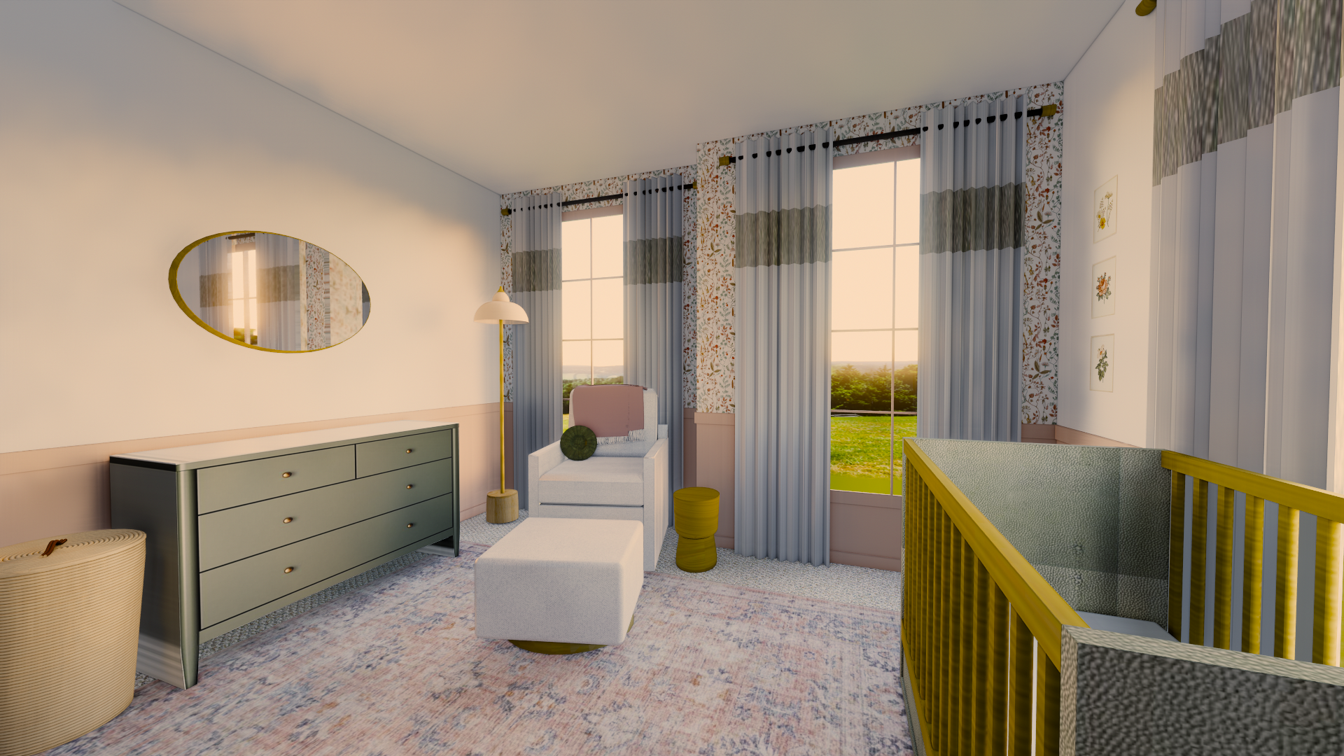
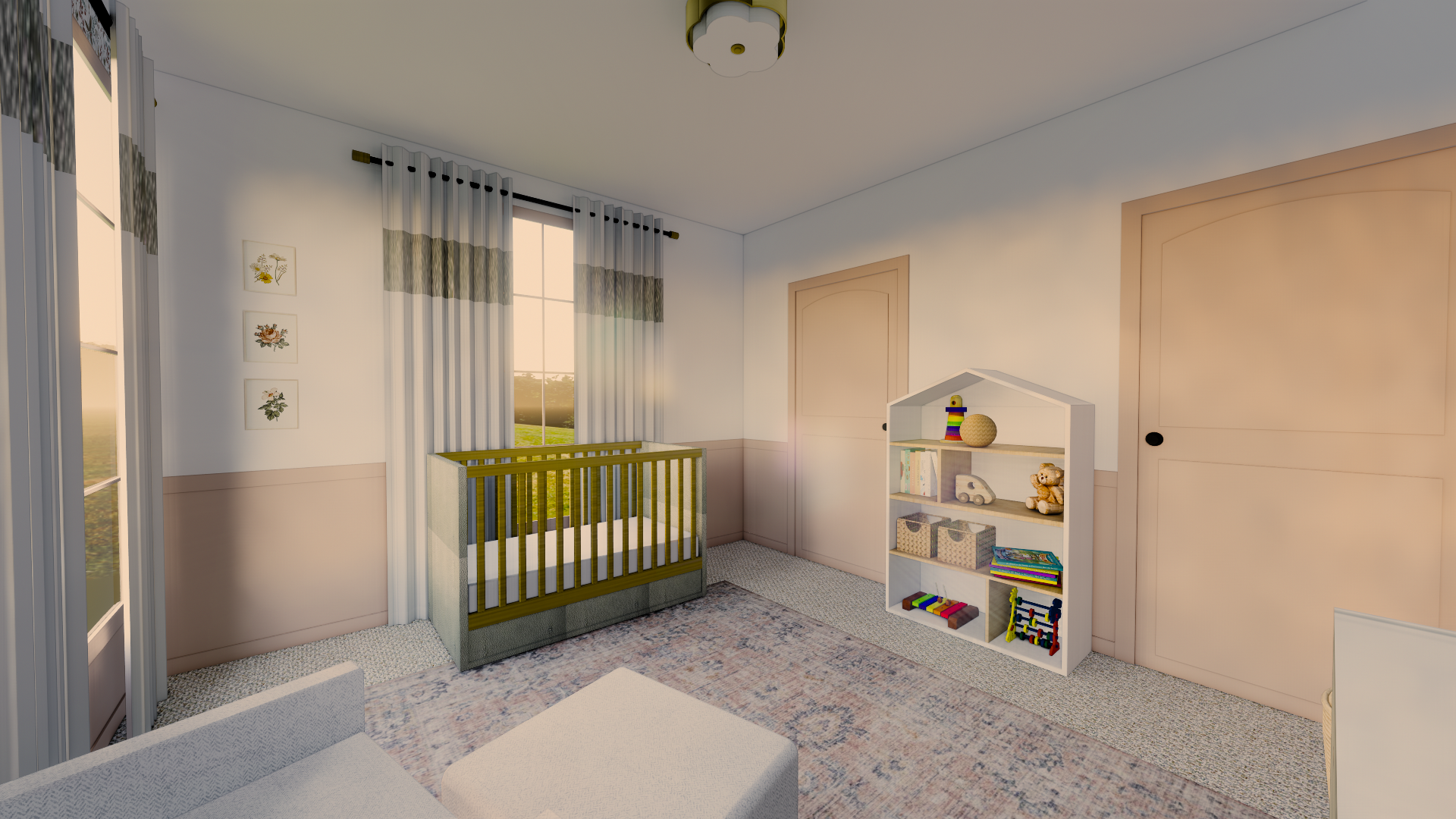
In the “girl” nursery, we went with a serene yet sophisticated palette of subdued pinks, corals, and peaches, accented with olive greens and warm grays. The room’s simple square geometry is dressed up with the addition of painted wainscot paneling, and a feature wall with delicate floral wallpaper.
From the sherpa glider and ottoman, to the shagreen crib, luxurious textures help the space feel polished. Warm wood tones and burnished brass detailing on the drapery hardware, mirror, and flower-inspired light fixture mix whimsy with style. Though delicate and pretty, this is a space that could grow along with the child for many years before feeling too juvenile.
Option Two: Primary Perfection
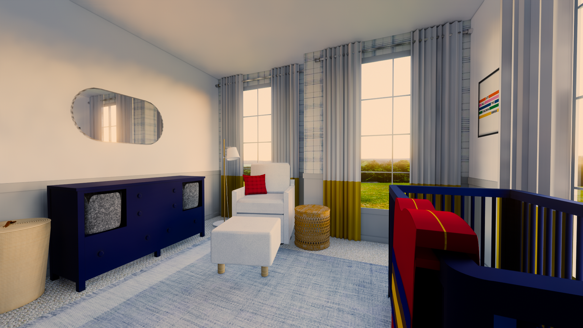
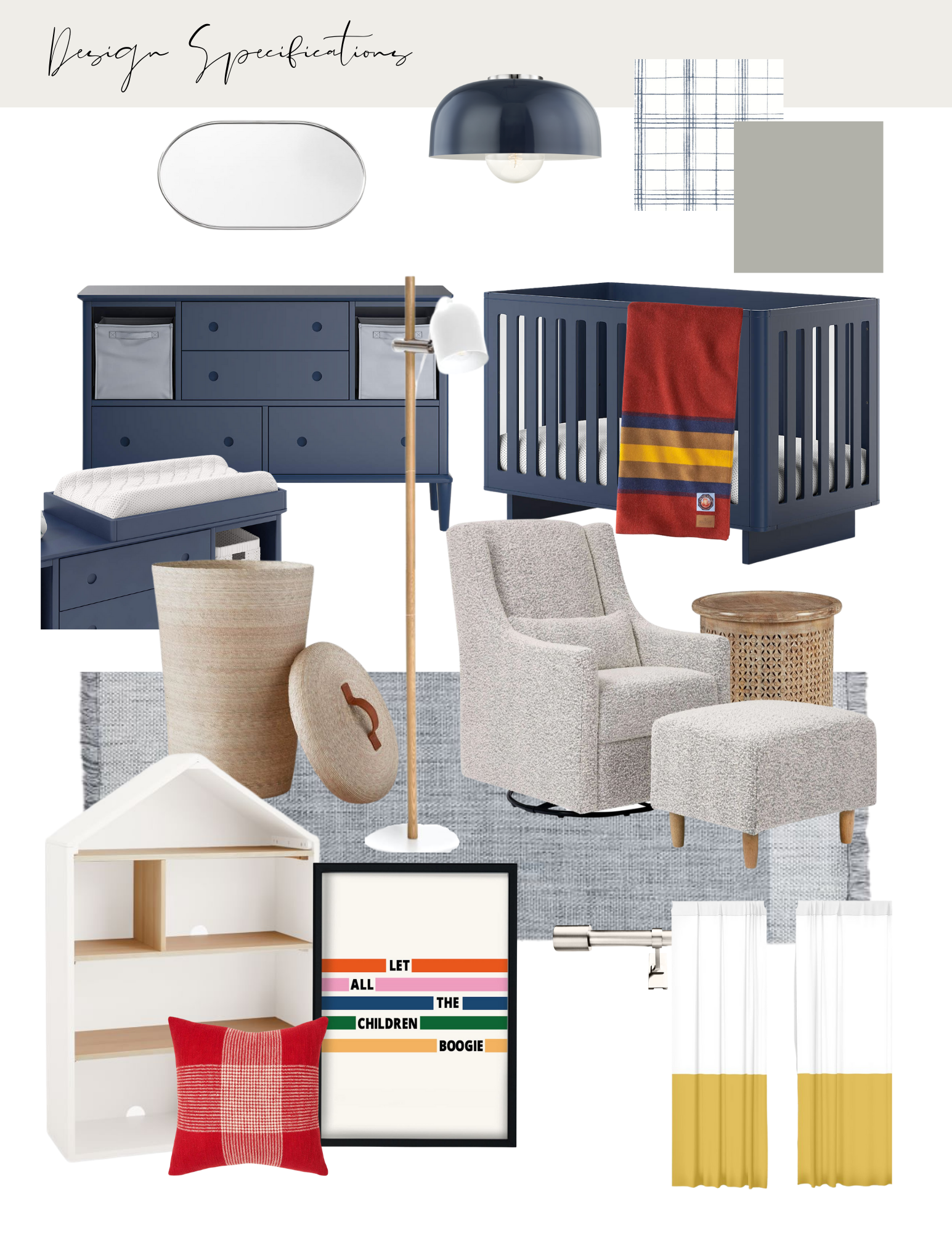
In the “boy” nursery, we’ve taken a classic primary palette of red, yellow, and blue, and made it feel fresh for 2021. A Pendleton wool throw, windowpane plaid wallpaper, and fun artwork add a retro nod to the space, while the navy furniture, bold colorblocked window treatments, and bucle glider set are all on-trend for today.
Taking a page from the plan in the first space, we wanted the boy’s concept to be a room that would feel kid-friendly and simultaneously sophisticated enough to grow alongside the child. We’ve kept the same layout, opting to leave the center of the room wide open for playtime, anchoring the space with a durable area rug.
Now we just sit tight and wait to see which of these two amazing spaces will be “delivered” for our client later on!
Looking for even more “pint-sized” design goodness? Don’t miss: Our Favorite Kids’ Room Design Trends for tips on creating a fun and authentic space that grows along with them!


