2022 Paint Color Trends
Some of the biggest names in color are giving us the “green light” in the coming New Year!
Inspired by nature, evoking a sense of vitality and newness, a plethora of greens have appeared on the rosters of some of the our favorite names in paint. With shades ranging from the gentle and serene to the more vibrant and invigorating, there’s truly a flavor for every taste in this viridescent collection.
1. Farrow & Ball | Breakfast Room Green
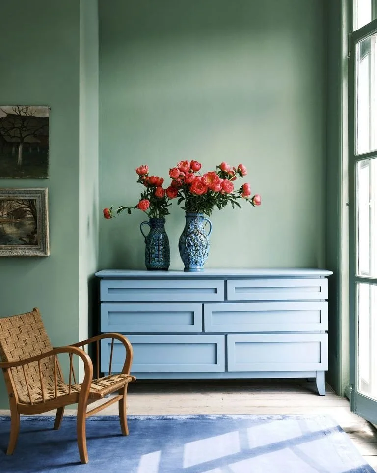
Photo courtesy of Farrow & Ball.
Farrow & Ball describes Breakfast Room Green is the most “cheerful” of all their greens, noting it remains lively in both bright sunlight or soft candlelight. Named after the usually east-facing English rooms designed for eating the first meal of the day, this color is particularly beautiful in the dawn light.
For a classic color combo, pair Breakfast Room Green walls with the brand’s slightly green, off-white James White on neighboring trim. A traditional palette would combine this green with Book Room Red and Lulworth Blue. For something more contemporary, try it alongside Mole’s Breath or Hay.
If you’re not blessed with an entire room dedicated to one meal (few are), try this shade in a formal dining room, your family room, or to liven up an entryway or corridor.
2. Benjamin Moore | October Mist

Photo courtesy of Benjamin Moore.
Benjamin Moore has selected October Mist, along with two other green hues (Fernwood Green and High Park) to include in their substantial 14-color “Color Trend 2022” palette. This color is described by the brand as a “gently shaded silver-green sage” tone.
As pictured, we think this color would be perfect in a more contemporary kitchen with slab style doors, low-contrast hardware, and minimalist detail. Rooms with ample sunlight will help bring out its true green hue, while in dimmer spaces October Mist could read as a more desaturated gray-green color.
Try pairing with the Benjamin Moore’s bold deep purple Caponata, or pale blue Mineral Ice for something more tranquil and subdued.
3. Sherwin-Williams | Evergreen Fog

Photo courtesy of Sherwin-Williams.
Sherwin-Williams Director of Color Marketing, Sue Wadden, describes this color as adaptable, and “a little more subtle, a little more recessive and a little more relatable” compared to some of the more bold green hues out there. She suggest pairing it with some of the brand’s other favorites such as Accessible Beige, Urbane Bronze, and Über Umber.
We think Evergreen Fog has enough neutral undertone to use it as an all-over color, and that it would make an excellent choice for doors and trim, or other detailed millwork such as stairs, mantels, built-in shelving or wainscot wall panels.
4. Behr | Breezeway

Photo courtesy of Behr.
With a hue that’s just as easy and breezy as the name lets on, we think this pretty pastel would be perfect in a soothing, spa-like bathroom. It would also work well in focused, calm environments such as a home office, homework room, or even in a nursery.
Behr describes Breezeway as a “relaxed and uplifting” sea glass green, and suggests pairing it with whites, grays, and natural wood tones for an effortless look. Try offsetting this color with Behr’s Gray Ashlar, or pair with Rainy Afternoon for striking tone-on-tone effect.


5. PPG | Olive Sprig
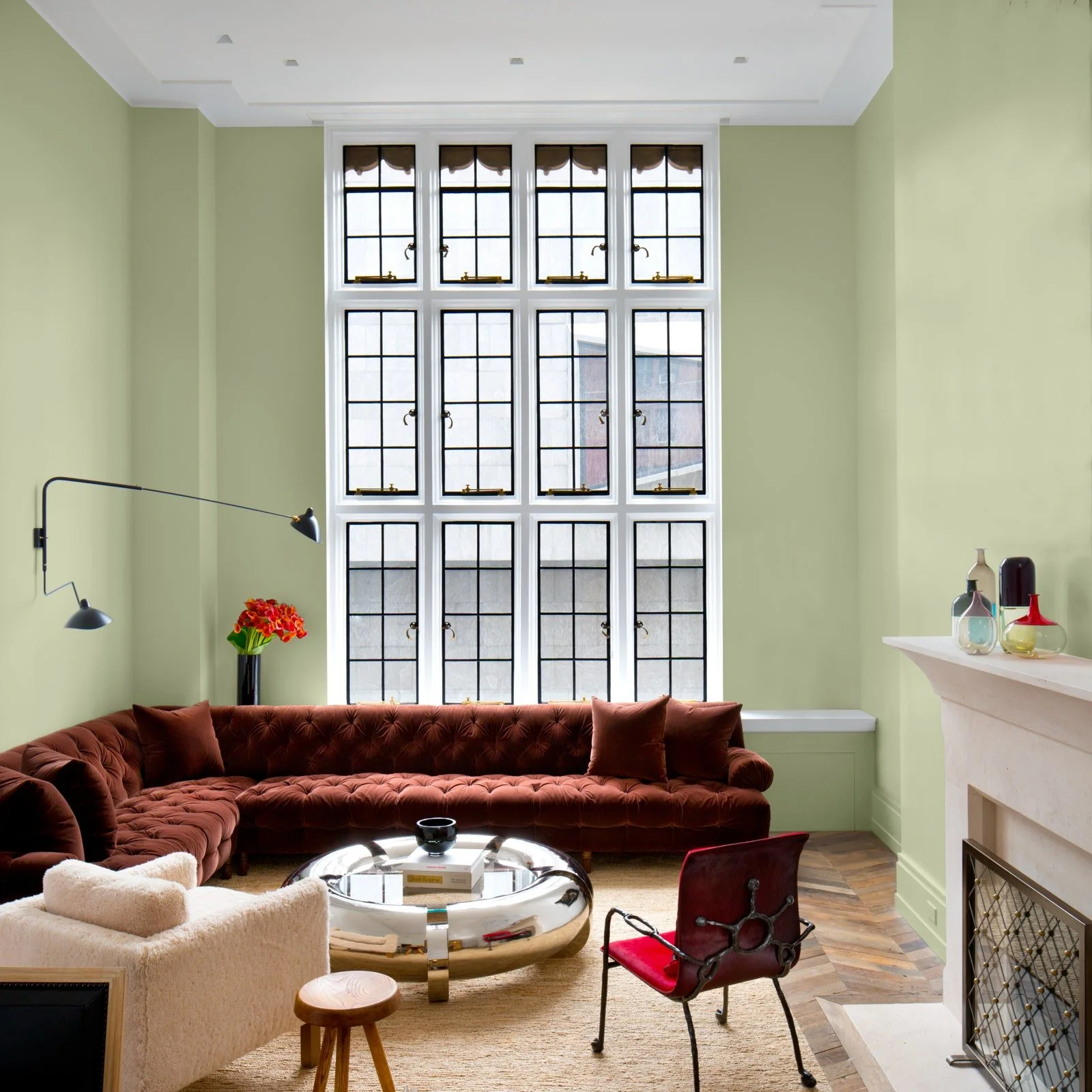
Photo courtesy of PPG.
Calling it a “relaxed, but enticing green that emulates the feeling of soothing aloe vera or a fragrant plant,” color experts at PPG advise that Olive Sprig would work just as well as an interior shade as it would on your home’s exterior.
This sophisticated mid-tone green is neutral enough to adorn the walls of a bedroom, and would look great in a kitchen alongside brass accents and natural wood tones. For a trendy two-tone kitchen makeover, try Olive Sprig on your base cabinets with Horseradish or Delicate White on the uppers.
For something more bold on the outside, pair it with Sourdough windows and trim. Want to make your neighbor’s really take notice? Try Olive Sprig next to a welcoming front door painted in the lovely gray-plum shade Magic Dust!
6. Dutch Boy | Cypress Garden

Photo courtesy of Dutch Boy.
Inspired by the resiliency of nature, Dutch Boy developed their color of the year, “Cypress Garden,” with subtle flexibility that works well next to colors with either cool or warm undertones. This color lends itself especially well to the “barely there” wood finishes trending across newer furniture and flooring offerings.
For a clean, understated palette, they suggest pairing this green with Warmed Silver and Over the Moon. Or for something a little more punchy (and perhaps nostalgic), use Cypress Garden with Sand Dunes and Peridot Sparkle — any of you 90’s babies out there will rejoice over this joyfully “cucumber-melon” combination!
7. Glidden | Guacamole

Photo courtesy of Glidden.
Glidden’s color of the year “Guacamole” is a fresh and delicious hue that delivers a palpable, organic energy to any space. The folks at Glidden suggest trying this color out in your bedroom, office, or library. Inspired by their parent company PPG’s color of the year “Olive Sprig,” they also recommend trying it alongside Horseradish or Delicate White trim and accents.
In our experience the more vivid a color is, the faster the trend can fade — and as the most saturated and vibrant green on our list, we’d suggest avoiding Guacamole as an all-over color selection. Instead try this one out as a lovely accent wall color, in a fun powder room, or even as a cheerful selection for any painted furniture needs. This guac is best served in small portions (with tortilla chips)!
8. Valspar | Blanched Thyme

Photo courtesy of Valspar.
Each of Valspar’s twelve Colors of the Year for 2022 are straight from nature, bringing a calm, comfortable presence into the home. Leaning into the restorative properties of the color green, their “Blanched Thyme” is described as “a natural green that helps us refocus on our physical and mental well-being.” According to Valspar’s Color Marketing Manager, Sue Kim, the shade is also “calming and nourishing – encouraging a calm balance within yourself and within your home.”
Blanched Thyme works beautifully against warmer wood tones, and pairs with warm metal accents such as copper and brass. Try it paired with any of the brand’s other 2022 colors of the year for a curated look! We like Blanched Thyme with the 70’s-inspired Rustic Oak or the clean and airy Orchid Ash in particular. For a classic paint+trim combination, try it alongside their Light Raffia or Cream in my Coffee.
Feeling the urge to add some new color to your life, but aren’t quite sure where to begin?
Take Studio 1049’s Design Style Quiz to discover what inspires you!