5 Simple Tips for Coordinating Tile
With a history dating as far back as 4000 BC, there’s no shortage of options when it comes to selecting tile!
Perfect indoors and out, on floors, ceilings, and just about everywhere in between, it’s no surprise that tile remains a highly sought-after material in both residential and commercial spaces. You simply can’t beat it when it comes to maintenance, durability, and style!
But with a seemingly endless library to choose from — and at such an extreme variety of price points — how do you even know where to begin? To help demystify things and set you up for success, we’ve put together our favorite tips and tricks for coordinating tile in your home.
1. Balance Bold Selections With More Neutral Elements
As we’ve mentioned before on the Studio 1049 blog, it’s important to create a focal point in any space. Having just one “star” tile in your design not only helps keep your budget in check, but avoids creating that sense of visual chaos that can occur when too many elements are shouting for attention.
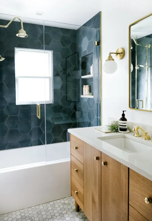
In a kitchen for example, a statement backsplash works best with a more subdued countertop material, or alongside a neutral cabinet finish. In a bathroom, sticking with something simple as the floor tile will let the shower or tub surround take center stage. This also helps create a “destination” of sorts that catches your attention as you enter the room. On the other hand, if you opt for a more intricate pattern for your wall or floor tile, you’ll want to pick something more simple for the tub and/or shower.
Sometimes the focal element in a room is the color! If you’ve selected a boldly colored tile as your main feature, try to go with classic shapes, typical scales, and standard installation patterns to help keep things feeling harmonious. The main thing to avoid is mixing-and-matching too many bold elements in just one space.

2. Play With Shape and Scale
An easy way to make a space feel polished and purposeful without overcomplicating things is to play with shape and scale — either by drawing comparisons, or contrasting them altogether!
For example, if you’re considering a 3” x 9” subway tile for your shower, going with something else rectilinear like a 12” x 24” tile for the floor would create a nice visual tie-in. You could even go a step further to connect the dots by using the same brick lay installation for both applications. Similarly, if you’ve found a larger format hexagon tile that you love as a backsplash or basin surround, a small scale hexagon mosaic would be a great compliment for the shower floor, or to accent a niche.
Alternatively, you could opt to really highlight a tile with a unique shape or scale by letting it stand alone while all other tile selections in the space share a common trait that’s different from your feature tile.
Including this variety of scale and format with your tile is not only visually interesting, but helpful in avoiding a space that feels too busy. As an added bonus, it’s probably easier to clean as well!
3. Explore Combining Different Materials and Finishes
A fun way to have a more curated look in your space is to mix-and-match tiles that fall within similar themes, but are made from different materials or have different finishes.
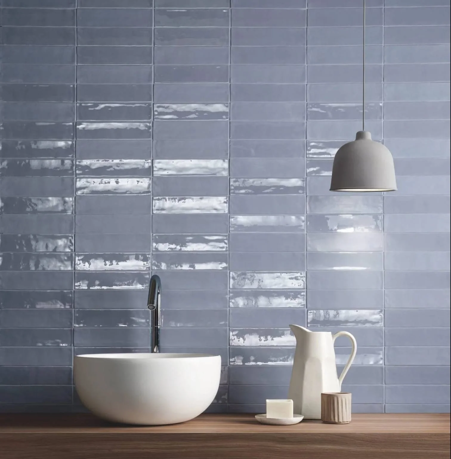
Similar to honed versus polished marble, many ceramic and porcelain tiles also come in both a glossy and matte version. This creates a lot of opportunity for you to get creative in how you use them throughout the space.
Using glossy tiles near light sources, windows, or mirrors is also a great way to fill a space with more light and make it seem larger. Just be careful to stick to matte tiles with the proper anti-slip ratings for floors in kitchens and bathrooms where water is often a concern. You should also avoid printed or stamped concrete tiles for wet areas, as they tend to stain and show signs of wear and tear more easily.
Marble and stone are great natural tile options that you can treat almost as “neutrals” throughout a space. Not only do they add a ton of texture to a room, but they make great compliments to some of the more colorful and intricate but less organic options out there such as glass, metallics, porcelain, and even hand-painted ceramic tiles.


4. Keep Colors and Patterns Consistent
Limiting your color palette, patterns or motifs, or even the installation design are all great ways to unify multiple tile selections in the same space. Having consistency across these elements will ensure that your choices make sense together.
Another consideration is grout. One approach is to match your grout as closely as you can to each tile selection so that your grout lines “disappears” into the overall design. If you’d rather call special attention to a tile’s unique shape or installation pattern, than go with a contrasting grout color to help highlight those oft forgotten spaces in between each tile!
In this example from our Havenwood project, we limited our tile palette to a simple cloud gray, selecting two different styles from the same collection. This design choice allowed us to accomplish two things in this kitchen — first, we were able go with a different installation pattern around the pot filler than we had used on the rest of the backsplash without it looking busy. Second, sticking with a more subdued tile color allowed us to use a bolder blue cabinet finish on the island base and on a neighboring section of cabinetry.

5. The Classics Never Go Out of Style
When in doubt, look to the classics for inspiration! There’s a reason selections such as Carrara, Calacatta, Marquina, Travertine, or even all white bathrooms have been around forever. They’ll never go out of style, and give you a safe way to experiment with some of the other techniques on our list without worrying that your space might look dated in just a few years.
Although the same rules apply as far as mixing scale, shape, and material, it’s much more foolproof if you’re selecting from coordinating classics. These options are also super versatile in their ability to coordinate with a variety of hardware and fixture finishes, paint colors, and lighting styles as these trends come in and out of style.
Consider going with something classic for your largest square footage in the room, such as the floor. If you need or want to update the backsplash, or a feature tile down the road, chances are you can still leave that initial classic selection in tact. This can provide you with a huge savings in time and money for future renovations.

With these five simple tips, we hope you feel more prepared for your next trip to the local tile store — or (more likely) the next time you go down the rabbit hole searching for tile online.
For even more on coordinating design elements in your homes, check out these other entries:
How to Blend Different Décor Styles
The “Do’s and Don'ts” of Coordinating Light Fixtures
Need a little more professional help? Schedule a free Discovery Call with our team today to talk about your next design project!