How to Mix Prints + Patterns Like the Pros
When we hosted our first Instagram “Ask Me Anything” earlier this month, one of our follower-submitted questions was how to successfully mix different prints and patterns within the same room. Although we gave a few tips on the spot, we thought this would be the perfect topic for a deeper dive on the blog, partially due to the maximalism trend we’ve seen popping up all over this year.
If Marie Kondo made you throw everything away in 2019, left only to be sitting alone in a stark, minimalist apartment for an entire year during the pandemic, chances are you’re at least somewhat open to exploring a “more is more” approach for a more energetic and inspiring space.
Here’s how to do it the right way.
Pay close attention to scale.
The most common pitfall in a room with multiple patterns is that it reads as too busy to the eye. This can be for a multitude of reasons (clashing colors, poor placement, etc.), but is probably because too little attention was paid to balancing scale. To help mitigate this, aim to choose just one large-scale print or pattern in a room that can be your “showstopper” feature while limiting all other patterns in play to medium- or small-scale selections.
By balancing the scale of each pattern, you can be sure that there’s no unhealthy competition. Think of your room as Destiny’s Child (looking at you, elder Millennials): if every pattern in there is a Beyoncé, it will be deafening. To make the design truly sing, you’ve got to have a Kelly, and yes, even a Michelle.

Find a thread that ties everything together.
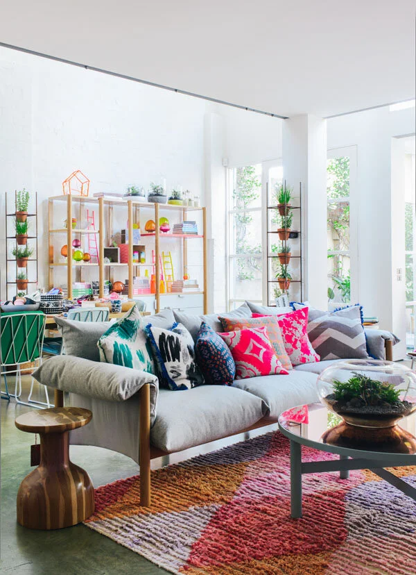
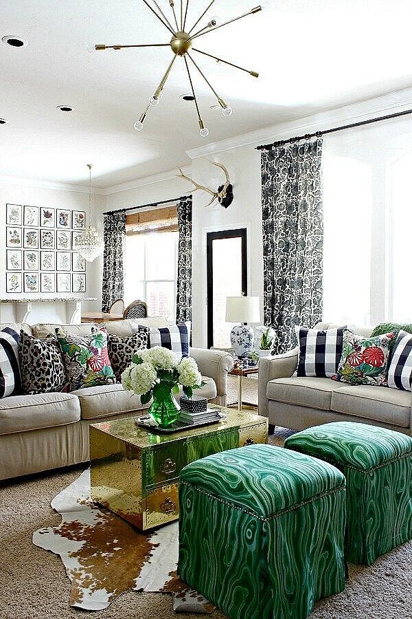
Perhaps the easiest way to tackle mixing patterns is to create some sort of boundary to play within. One way to achieve this is by defining a limited color palette to work within. Pattern mixing is the perfect opportunity to employ the 60-30-10 rule. Following this approach, roughly 60% of your room should be the dominant color, while 30% is a secondary color, and just 10% is reserved for an accent color. If you stick to this limited palette, you can feel free to explore different patterns without the risk of things becoming too chaotic.
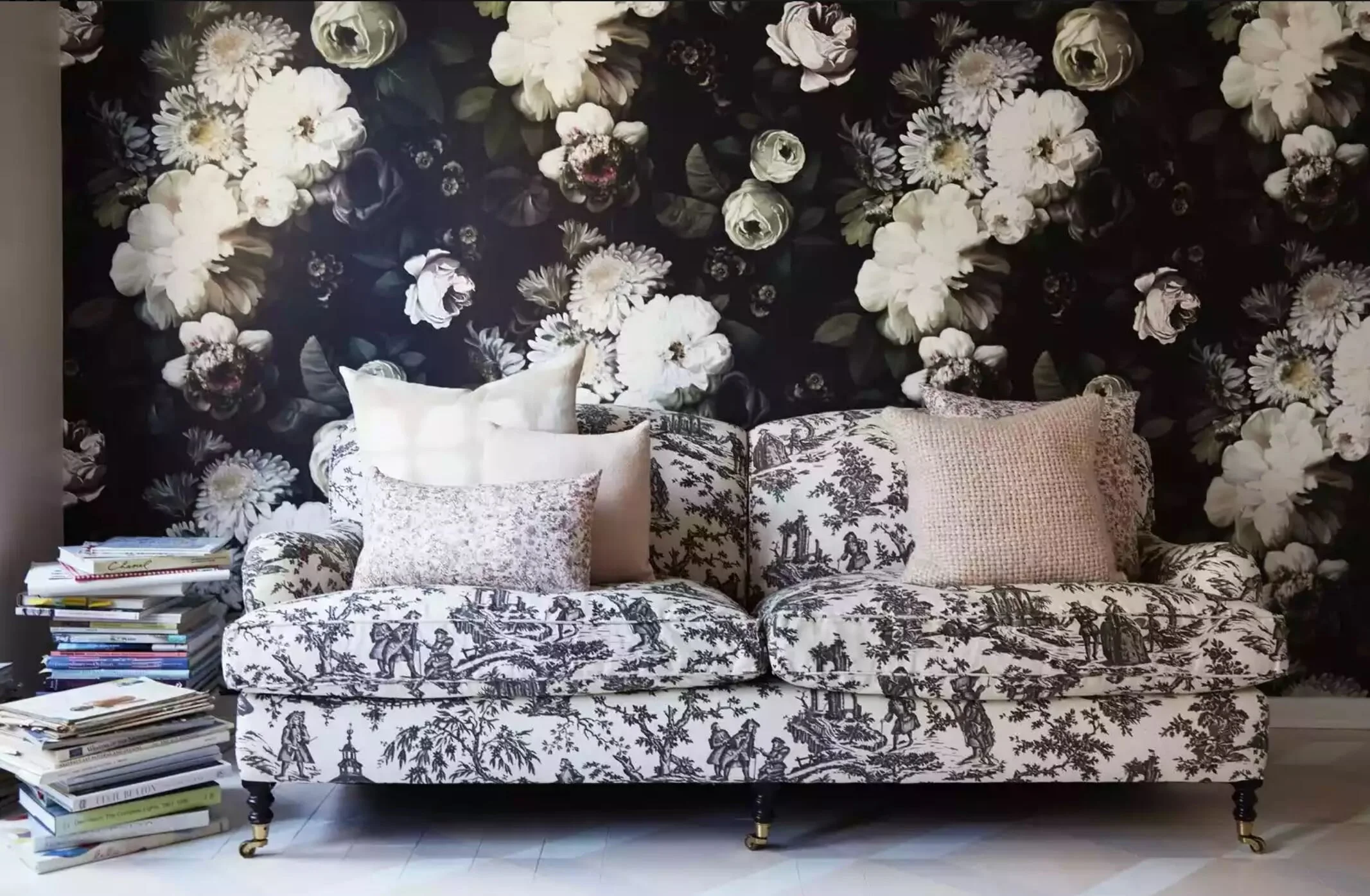
In addition to color, another approach would be to use a unifying texture or fabric to marry multiple patterns together. For example, tonal stripes and dots will play more nicely together if they each show up as velvet. If you want to successfully combine patterns with obvious differences, include an equally obvious link between them. It will help your eyes agree that they belong together.
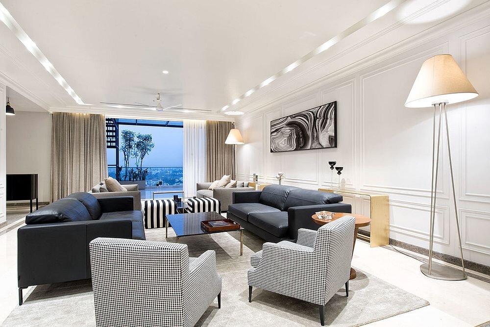
Contrast is your best friend.
You’ve identified your showstopper and have found a unifying thread that ties everything else in the room together — but is it possible to create a space where each beautiful element still shines on its own? Yes! How? By leveraging the power of contrast.
Although the goal is to create a cohesive design when mixing patterns, you also want to keep things from becoming too one-note. This isn’t minimalism after all! Try playing with your pairings to incorporate some contrast. For example, if your main furniture piece (sectional) is a light patterned upholstery, go for something darker with the accents (armchair). If your wallpaper is a bold or complex pattern, go for something that’s more reserved with your window treatments and/or rug.


Create balance throughout the entire room.
One key in mixing prints and patterns is to make sure they’re spread evenly throughout the entire room. If everything patterned shows up on just one side, the room’s visual weight will be overwhelmingly lopsided.
This can be tricky at times, such as in rooms where the sofa sits in front of the windows (upholstery, throw pillows, and window treatments all competing), or where wall space may be lacking (no opportunity for art or wallcoverings) — but look for ways to sprinkle in pattern in unexpected places. A fun rug, accent chair, or even something like a patterned lampshade can help add some balance to your design.
Opt for cousins, not siblings.
Broaden your search to include prints and patterns that resemble each other versus selecting multiple versions of the same pattern. Rather than simply choosing several striped patterns, try pairing a stripe with a relaxed plaid, or a linear herringbone. Explore mixing a floral with something that’s more botanical. Use a cheetah next to a leopard or some other animal print, and so on.
Even if you follow the above-mentioned rules for scale, palette, contrast, etc., your design will likely still read as busy if it’s essentially the same pattern repeating everywhere you look. Incorporating loose “themes” can help different patterns make more sense together.
Know when to say when.
While a good design shouldn’t allow your eye to rest for too long in any one place, even the most maximalist designer out there will tell you that rooms need some space to breathe. Prints and patterns are inherently bossy, so aim for just four or five max in larger rooms (less for small spaces). Remember, just because you can doesn’t mean you should. Following these tips and showing a little bit of restraint will help highlight each of your carefully curated selections in their best light.
Now, go have some fun experiment with prints and patterns — and be sure to tag us in your room pics (Instagram: @Studio1049). We’d love to see the fun combos you come up with!
When it comes to patterns, are you more of a classic stripe, a delicate floral, a vibrant animal print, or a cool abstract kind of person? Let us know in the comments below!
If you’d like some help making your different prints and patterns sing together in harmony, click below to get in touch with the Studio 1049 team.